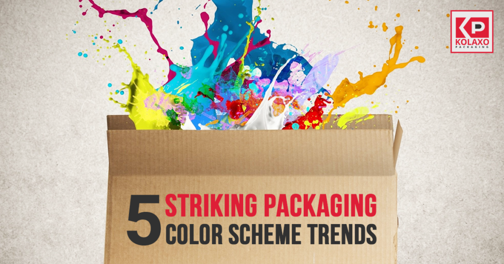
The human brain is used to associating colors with feelings and emotions. For instance, the use of red color is an indication of intensity, prohibition, or anger, and green is associated with life and nature. Using this psychology, brands and companies have successfully developed to associate colors schemes into their packaging that can bring out the audiences’ emotions and create an emotional relationship between customers and products. colors have become a marketing tool for businesses and every brand has a signature colors scheme that is consistently used across all their marketing and advertisement campaigns.
We have compiled a few trending packaging colour schemes that are guaranteed to catch the attention of your customers and allow them some time with your products:
The use of colors that can instantly lift the observer’s mood is essential, especially after everything that everyone has been through since last year. Cheerful, bright, attractively energetic colors are the best way of handling this task. The juicy colors are paired with lighter backdrops to create a prominence effect. This combination comes as best due to the perfect contrast and attraction that they create. The presence of a pale background is as effective for the design as the refreshing colors that make it prominent.
Brands of the beauty industry are taking packaging to the next level. The use of skin tones that revolve around the beauty of all skin colours is not only sharp but relatable to the customers too. The best part of this colour scheme movement isn’t only the use of skin tone, it is prioritized because of the various colours that are celebrated. It is unlike the beans aids and other products that had only one colour, this colour scheme revolves around all of them.
The ideal way of creating harmonious packaging that offers a little peace of mind is through the use of calming colours that are the similar and perfect blend. There are several ways of using this colouring trend; some are made of the same colour with different shades or sometimes shades are placed together on a colour wheel. The effect is a soothing colour scheme with calming transitions.
In addition to calming and refreshing, surreal colouring has also grabbed a bunch of attention. This creative design assigns colours to elements in the design that are not realistic which creates the effects of a dream. The goal of the design is to create a momentary escape for the audience and provide a creative refuge to the mind.
Everyone loves things that remind us of old-school products that we loved as kids and youngsters. The brain associates faded colours with memories of the past and good ones in that case. However, the colour schemes are not the only playing cards here, some designers even use effects that make the packaging look weary out of time. Your packaging is the first line of defence when it comes to sales. Customers have no idea of your products unless they have tried them out, however, their confidence and encouragement in buying your products are elevated by your packaging choices. The more attractive the packaging, the better will be the sales.
 5 Ways Eco-Friendly Foam Packaging Helps the EnvironmentMarch 10, 2025
 6 Tips to Budget Better & Control Custom Packaging CostsFebruary 27, 2025
 Top 5 Advantages of Using Pacdora for 3D Customized Packaging DesignsFebruary 10, 2025
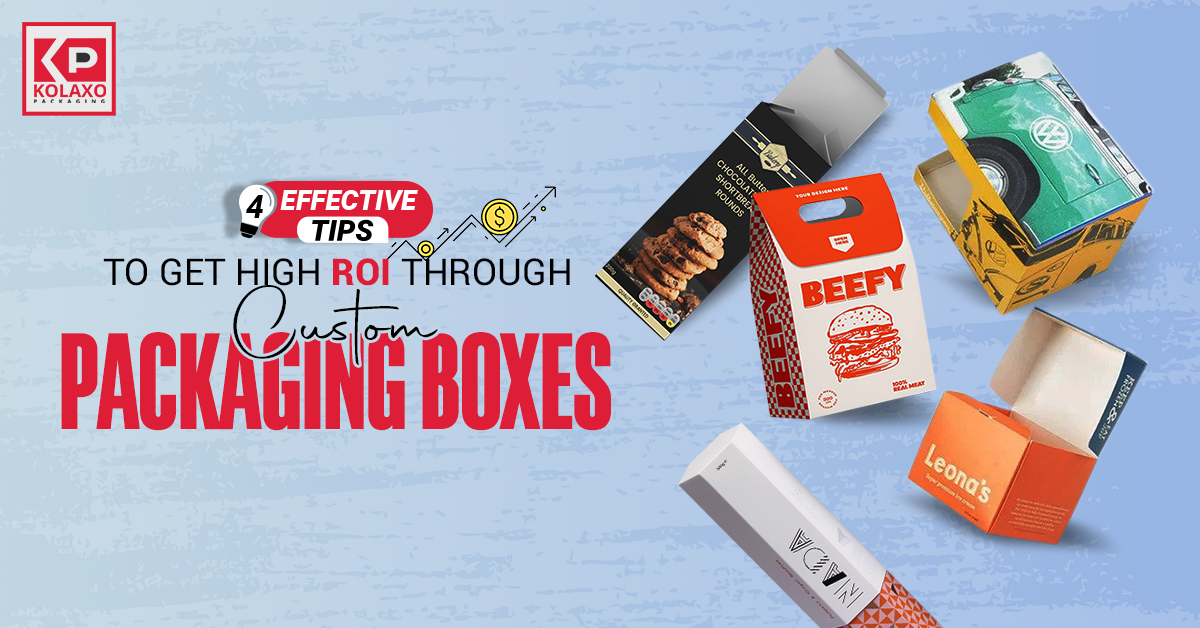 4 Effective Tips to Get High ROI Through Custom Packaging BoxesJanuary 22, 2025
 4 Common Mistakes You Need to Avoid When Manufacturing Custom Printed BoxesJanuary 8, 2025
 How Can You Enhance Your Brand Awareness With Social Media?December 16, 2024
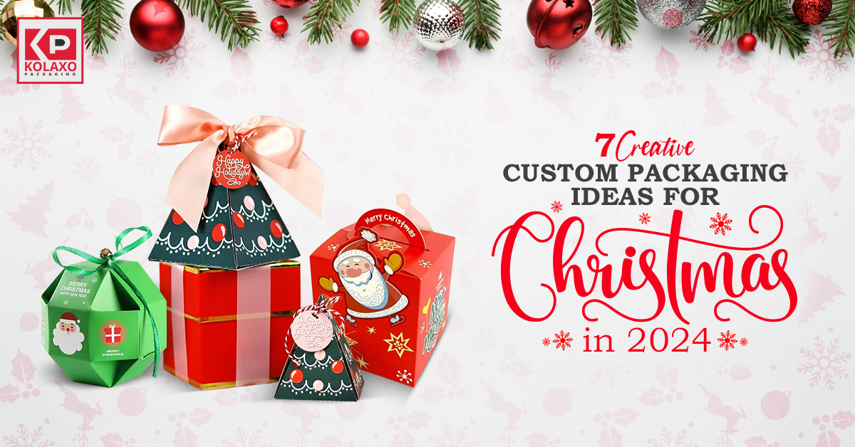 7 Creative Custom Packaging Ideas for Christmas in 2024.December 5, 2024